The Visual Arts Class 7 chapter — Chapter 15 of NCERT’s Class 7 Arts textbook Kriti, titled “Objects in Icons and Symbols” — runs about 14 pages in the book and teaches how everyday objects become icons, signages and symbols.
This page points you to the official chapter PDF right below, followed by a plain-language walkthrough of what the chapter holds, so you can read it before your art class.
Download the NCERT Visual Arts Class 7 Chapter PDF
NCERT publishes the complete Kriti textbook on its official website, and Chapter 15 is part of that book. Open the Visual Arts Class 7 chapter PDF (Kriti, NCERT Class 7 Arts) to read the official NCERT edition online or save a copy before your next class — the file carries all four activities, the matching exercise and the peer-assessment checklist in full.
Chapter 15 at a Glance: What the Visual Arts PDF Holds
The table below shows what the chapter holds — its sections, figures and activities.
The chapter is entirely hands-on. Four numbered activities move you from cutting stencils, to drawing one object four ways, to designing real signages, to reading symbols; the unit closes with a matching exercise, a peer-assessment checklist and a learning-outcomes table.
What Class 7 Visual Arts Covers: From Everyday Objects to Icons and Symbols
Knowing where a chapter is going makes each activity easier to follow. Here is the arc of Chapter 15.
The chapter opens with a shloka from the Chitrasutra of the Vishnu dharmottara Purana that calls painting the foremost of the arts — one that bestows dharma, artha, kama and moksha, and brings auspiciousness wherever it is established. The shloka frames the unit’s purpose: visual art is a way of carrying meaning, not just decoration.
From there the book moves straight to how visuals communicate. In the opening section it defines an icon — a simplified visual representation of an object, place or idea — and points at the icons on a mobile phone display: the clock, the battery, the network and the applications. Everything that follows is practice in making such icons.
The four activities carry the chapter:
- Activity 15.1 — understanding simple icons by cutting stencils from newspapers.
- Activity 15.2 — drawing one object four ways: contour, silhouette, shading and icon.
- Activity 15.3 — designing icons for signages around the school.
- Activity 15.4 — reading objects as symbols, using the Dharma Chakra and the spectacles of the Swachhata Abhiyan logo.
The chapter ends with a short “Is there a difference between icons and symbols?” section, a matching exercise, a peer-assessment checklist for the signages, and a learning-outcomes table.
Key Concepts: Icons, Space, Shading and Symbols
Visual communication works through simplified pictures, and this chapter teaches you to read them first and make them second. Four ideas carry the whole unit: what an icon is, how space works inside it, how shading changes a drawing, and when a picture becomes a symbol.
Icons: Simplified Visuals That Communicate Fast
Before you can make an icon, you need to know what one is — the chapter defines it right in the opening section. An icon is a simplified visual representation of an object, place or idea. The simplification is the point: details are removed so the picture can be understood instantly, at a glance, without reading.
The book’s everyday example is a mobile phone display, where icons show the clock, the remaining battery, the network connections and the applications. The same idea appears in logos, signages and even emojis while texting. Keep this phone screen in your head for the whole chapter — every activity is practising that same skill of simplifying.
Positive and Negative Space in Icons
Before you draw an icon you have to learn to see two kinds of space. Positive space is the shape the object itself occupies — the fork or the spoon. Negative space is the blank space around and between objects.
The book’s fork-and-spoon icons make the idea concrete: in one icon the black is the fork, in the other the black is the background. So black is positive in the first image and negative in the second. Icons deliberately keep a lot of negative space, because a shape surrounded by empty space stays visible even at very small sizes.
Contour, Silhouette, Shading and Icon: Four Ways to Draw One Object
This is the skill core of the chapter. You take one object and draw it four times, and each technique changes how it appears on the page. Here are the four techniques side by side:
| Technique | How it is made | How it looks | Flat or solid? |
|---|---|---|---|
| Contour | An outline drawn while looking at the object | Transparent-looking line drawing | Two-dimensional |
| Silhouette | The contour filled in with one flat colour | Opaque, solid shape | Two-dimensional |
| Shading | Tonal variation using cross-hatching or stippling | Light and shade, rounded form | Three-dimensional |
| Icon | A simplified shape that keeps only essential details | Clean and graphic, quick to read | Two-dimensional |
Two things matter for the activity. First, you keep the same object for all four drawings, so the comparison is about technique, not subject. Second, the order builds: the contour gives you the outline, the silhouette fills it, the shading makes it look real, and the icon distills it back to a simple shape.
To remember the order of the four techniques — contour to silhouette to shading to icon — use the initials CSSI: “Can Some Students Illustrate?”
The silhouette deserves special attention, because the chapter says it can sometimes be the icon itself: a flat, filled shape with no inner detail is already a simplified image that reads quickly.
Icons vs Symbols: What the Chapter Says
Students mix up “icon” and “symbol” constantly, so the chapter settles the question in a short dedicated section. A symbol has a deeper meaning — it represents ideas or emotions, and it need not resemble what it stands for. An icon can become a symbol when a community agrees to give it that extra meaning.
Take round spectacles. To someone without the cultural connection, they are simply a pair of spectacles — an icon of an object. To many Indians, they read as Mahatma Gandhi, his values and his work — a symbol. The same picture, two different readings. That is the whole difference, and the chapter’s symbol study in Activity 15.4 builds on it.
Key Figures in the Chapter and How to Read Them
The illustrations in this chapter are all doing real teaching — showing you space, a measuring trick, or a symbol. Here are the main ones and what each is showing.
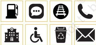
The icons in this figure are the chapter’s definition in picture form: each one is a simplified visual representation of an object, place or idea. Notice what is NOT drawn — no texture, no shadow, no extra lines — because an icon only needs to be recognised, not admired.
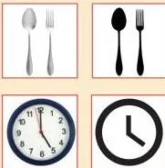
This figure pairs objects with their icon versions. Its caption says it directly: notice how the details have been removed to create the icons. You keep only the shape that identifies the object; everything else goes.
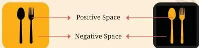
These are the fork and spoon icons. In the first, black is the object — positive space; in the second, black is the background — negative space. The wide blank areas are what keep the object readable at a very small size.

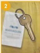
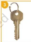
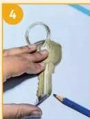
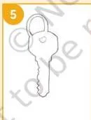
The materials figure lists what Activity 15.1 needs: old newspapers or magazines, scissors, plain A4 paper, pencil and eraser.
The five steps take you from finding a clearly visible object, to outlining it, to cutting (steps 3 and 4 produce the stencil), to drawing the shape with the stencil in step 5.
Step 6 — colouring inside the outline — is where you see the positive and negative space your cut-out created.
The “Note to the Teacher” figure shows the measuring trick you will use in Activity 15.2: hold the pencil at arm’s length, slide your thumb along it until it aligns with the object, and use that measurement to mark proportions on your paper.
This figure is the optional part of the silhouette step: an inverse image made by switching the colours of the positive and negative spaces. The negative space becomes the object colour and vice versa — a quick way to see how much the shape itself carries the image.

This cross-hatching detail shows the lighter end of the technique: when you loosely overlap lines, the tone stays light; pack the lines close and the tone darkens. Shading only looks three-dimensional when the tone varies — light where light falls, dark in shadow.
Good icons take practice and keen observation — that is the caption’s message. Your first contour or icon will not be perfect; the exercises exist to train the eye, and comparing your contour, silhouette, shading and icon drawings is part of the training.
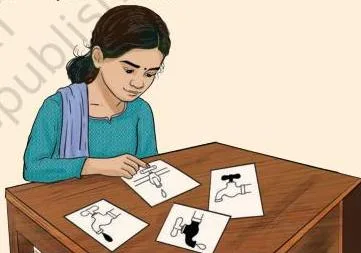
The final step of Activity 15.3 is to show the signage to friends and ask what they think. If the icon works, the message is read instantly; the questions your friends ask tell you exactly what to improve.
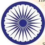
The Dharma Chakra sits at the centre of the national flag — a navy blue wheel with 24 spokes, taken from the Lion Capital of Sarnath, made in the 3rd century BCE by the Mauryan Emperor Ashoka.
The book reads its meaning layer by layer: blue for the sky and ocean, the wheel for progress, and the 24 spokes for the 24 hours of the day.
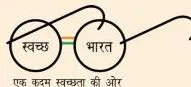
The Swachhata Abhiyan logo trades on a symbol everyone in India can read: the round spectacles stand for Mahatma Gandhi, and the bridge of the spectacles is drawn as the national tricolour — signifying the whole nation uniting to achieve his vision of a clean India.
The Four Activities in Detail: Stencils, Signages and Symbols
The chapter teaches by doing, and each activity builds on the one before: first you learn to see shapes, then you draw one object four ways, then your icons go up around the school, and finally an object takes on a deeper meaning.
Activity 15.1: Simple Icons and Making a Stencil
This first activity trains your eye to see positive and negative space, then turns that seeing into a tool you can reuse.
Materials — the full list the book gives:
- Old newspapers or magazines
- Scissors
- Plain A4 paper
- Pencil and eraser
The six steps:
- Look through old newspapers or magazines and identify two or three objects that are completely and clearly visible.
- Carefully highlight the outline of the object you chose.
- Cut out the section of the page that contains the object.
- Cut along the outline — the cut-out shape is now a stencil.
- Place the stencil on a sheet of paper and draw the object through it.
- Colour inside the outline, and notice the positive and negative space your colouring has created.
Then comes the test: show the drawing to your friends and ask them to identify the object. If the shape alone is enough, your stencil has done its job. The figures in the walkthrough above show each of these steps as the book prints them.
Activity 15.2: Drawing One Object Four Ways — with a Worked Example
This is the biggest activity in the chapter. You choose one object, keep it for every drawing, and work through the four techniques in order.
The materials list for Activity 15.2 is short: five A5 sheets (half of A4), a sharpened pencil, an eraser, colours and a pen.
The book’s note to the teacher insists each student chooses their own object and uses the same one throughout — that is what makes the comparison between techniques meaningful.
Contour first. Keep the object more than 2–3 feet away and observe its shape and size closely.
Use your pencil as a measuring tool: hold it at arm’s length, place your thumb on it, align it with the object, and measure its parts before marking the proportions on your paper.
Then draw the outline, keeping your eyes on the object as you draw each part, until the contour is complete.
Silhouette second. Draw the same contour again, or trace it from the first drawing. Colour inside the contour to make it flat, then use a different colour to fill the negative space around the object. The optional challenge: on another A5 sheet, make an inverse image by switching the colours of the two spaces.
Shading third. Observe how light falls on the object first — that decides where the dark tones go. Then build light and shade with these two techniques:
- Cross-hatching — shading with criss-cross lines. Closely overlap lines to create darker tones; loosely overlap lines to create lighter tones.
- Stippling — shading with dots. Place the dots close together for darker tones; spread them out for lighter tones.
Use a separate A5 sheet for each technique — the book is explicit about this, because the two techniques look very different and each needs its own practice.
Icon last. Gather your contour, silhouettes, cross-hatching and stippling, and ask: which of these will you use to make the icon? The icon must be simplified but still identified quickly, so it needs clear shapes and only important details. Sometimes the silhouette alone can be the icon. Finish the icon on an A5 sheet in colour.
Worked example — a school water bottle. Here is how one student could take a single object through all four techniques, step by step:
| Stage | What you do | Why this choice |
|---|---|---|
| Contour | Place the bottle 2–3 feet away. Measure its height with the pencil trick, compare the width against it, and mark both on the A5 sheet. Draw the outline while looking at the bottle, not the paper. | Measuring first keeps the proportions right; looking at the object keeps the shape honest. |
| Silhouette | Trace the contour. Fill the whole bottle shape with one flat colour, say deep blue, and fill the background with a second colour, say cream. Optional: make an inverse copy with the colours switched. | A flat fill removes inner detail, so the bottle reads as a pure shape — the same shape a signage would use. |
| Shading | Draw the contour again and notice the light comes from the left. Cross-hatch with lines packed close on the right side (shadow) and loosely overlapping lines on the left (lit). On a fresh A5 sheet, repeat the same light-and-shadow plan using stippling — dots close together in the shadow area, spreading out towards the light. | Tonal variation is what tells the eye where the light is; without a range of tones the drawing stays flat. |
| Icon | Start from the silhouette. Keep the bottle’s recognisable outline and its cap line; drop the label text, the highlight streak and the small ridges. Fill it in one colour and leave plenty of empty space around it. | At phone-icon size, the bottle shape plus the cap line is all the eye needs to identify it. |
When the icon is finished, the chapter asks a design question: if you had to use your icon to communicate information, what would it be? The question is practising the idea that icons carry messages.
Activity 15.3: Designing Icons for Signages
A signage is a visual that tells you where a space is and what it is used for. In this activity, your icons get a real job: they become signages for your school. The six-step method runs like this:
| Step | What you do | Why it matters |
|---|---|---|
| 1 | Choose a space in your school — entrance, washrooms, play area, dining space, library, a place for bags and shoes. | A real space gives the icon a real purpose to communicate. |
| 2 | List the objects that come to mind for that space. | The objects are the raw material for the icon. |
| 3 | Choose the most important object. The door in an exit signage works because it is the essential feature of exit. If two objects are needed, combine them: a spoon and fork for a dining area, a palette and brush for an art room. | One strong object communicates faster than a crowd of details. |
| 4 | Simplify the object into an icon: experiment with contours and silhouettes, add only characterising details, and use only one colour. | These are exactly the icon rules from Activity 15.2, now applied to a purpose. |
| 5 | Create the icon in two or more versions. | Comparing versions shows which simplification reads best. |
| 6 | Choose the clearest version and make the final signage on an A5 sheet. Show it to friends and ask what they think. | The test of a signage is whether someone else reads it instantly. |
The book adds an important note about local context: a fork and spoon assume one particular way of eating. If you do not use a fork and spoon when you eat, think of alternative food icons based on the objects you actually use — the signage has to mean something to the people who will see it.
Activity 15.4: When Objects Become Symbols
The final activity steps beyond icons: an object becomes a symbol when its meaning is accepted by a community. Symbols have a deeper meaning and represent ideas or emotions, and they may not directly relate to the visual they represent.
The chapter’s first example is the Dharma Chakra:
- It forms the centre of the national flag — a navy blue wheel with 24 spokes.
- It is a depiction of the “wheel of the law”, taken from the Lion Capital of Sarnath, made in the 3rd century BCE by the Mauryan Emperor Ashoka.
- Its meaning is read layer by layer: blue represents the sky and ocean, the wheel represents progress, and the 24 spokes represent the 24 hours of the day.
The second example is the Swachhata Abhiyan logo: the round spectacles represent Mahatma Gandhi, and the bridge of the spectacles is the national tricolour. The logo signifies the entire nation uniting to achieve Mahatma Gandhi’s vision of a clean India.
The chapter closes the activity with a question worth carrying beyond art class: look at the logos of companies, institutions and political parties, and ask what objects are used as symbols and what meanings they carry.
Art Terms You Need: A Chapter Glossary
The “Match the Illustrations” exercise at the end of the chapter asks you to pair pictures with the chapter’s terms. Here they are in one place, plus the space terms that run through the activities.
| Term | What it means in this chapter |
|---|---|
| Icon | A simplified visual representation of an object, place or idea. |
| Positive space | The space the object itself occupies. |
| Negative space | The blank space around the object. |
| Stencil | A shape cut along an object’s outline, used to draw or colour that shape on paper. |
| Contour | The outline of the object, drawn without filling. |
| Silhouette | The contour filled in with flat colour, so the object looks opaque. |
| Cross-hatching | Shading with criss-cross lines; closer lines create darker tones. |
| Stippling | Shading with dots; closer dots create darker tones. |
| Signage | A visual that tells you where a space is and what it is used for. |
| Symbol | An object taken to carry a deeper meaning, representing ideas or emotions. |
Common Mistakes in This Chapter and How to Fix Them
Five confusions catch students in this chapter. Name them now and you will avoid them in class.
| Mistake | Correct rule | How to check your answer |
|---|---|---|
| Confusing an icon with a symbol | A symbol has a deeper meaning and need not resemble what it stands for; an icon becomes a symbol only when a community gives it that extra meaning. | Ask: does this picture carry an agreed idea or emotion? If yes, it is a symbol — the round spectacles are an icon of an object to one reader and a symbol of Mahatma Gandhi to another. |
| Reversing positive and negative space | Positive space is the object; negative space is the blank space around it. | In the fork icons, name which black shape is the object and which is the background — in one image black is the fork, in the other black is the background. |
| Keeping too much detail in an icon | Icons drop detail so they can be read at very small sizes; keep only the characterising details. | Shrink your drawing mentally to phone-icon size — can you still identify it? If not, remove more detail. |
| Shading with uniform spacing | Closer cross-hatch lines or dots create darker tones; wider spacing creates lighter tones. | Check that the lit side of your object is light and the shadow side is dark; a flat, even tone will not look three-dimensional. |
| Copying a picture instead of observing the object | The book asks for original artwork from your own observation, not copies of other images. | Is the real object in front of you while you draw? Your contour should come from looking at the object. |
How This Chapter Is Assessed: Competencies and Peer Review
This is an art-classroom chapter, so “assessment” here is a set of competencies and outcomes that the teacher and the student check as the work happens — not a marks-based board paper.
The Kriti book assesses visual arts through the Middle Stage competencies, coded C-1.1 to C-4.2:
- C-1.1–C-1.2 — expressing personal and everyday experiences through visual art forms, and working flexibly with others.
- C-2.1–C-2.2 — creating artwork that challenges stereotypes, and connecting visual imagery and symbols with personal experiences and emotions.
- C-3.1–C-3.2 — using materials, tools and techniques with care, and refining work from planning to final presentation.
- C-4.1–C-4.2 — knowing local and regional art forms, and describing the life and work of local artists.
Chapter 15 then prints its own learning-outcome table with two columns for each outcome — Teacher and Self — to be ticked as each is achieved. The outcomes are the six skills in the next section.
The chapter also ends with a peer-assessment checklist: look at the signages your classmates made and write a few lines on these four questions:
- Are there any icons in the signage? Describe them.
- Is the information on the signage clear and easy to understand?
- What two qualities did you like about the signage?
- What do you think can be improved in its design?
So the honest picture is that this is classroom and peer assessment of skills, not an exam paper. As with every textbook, the chapter’s contents and the examinable syllabus are not always identical — check the current official syllabus.
Learning Outcomes of Chapter 15, Restated Simply
These are the chapter’s own learning outcomes, turned into things you can do. If you can do all six, you have finished the chapter.
- Watch an object closely and draw it as it actually looks — not as you imagine it.
- Create your own icons of familiar objects.
- Describe the meanings conveyed by familiar icons, symbols and logos.
- Point out the positive and negative spaces in icons and symbols.
- Use cross-hatching and stippling to show light, shade and shadows in an artwork.
- Design, create and display your own signages.
Related Resources: More Class 7 Arts Help
This listing is maintained for the 2026-27 academic session using the NCERT textbook information available to us. NCERT remains the authority for confirming the latest edition.
If this chapter is part of your revision, these pages will help you move around the book quickly:
- Class 7 Arts (Kriti) book page — the full chapter list for the book, so you can open any chapter from here.
- Class 7 notes hub — study help across all Class 7 subjects.
- All CBSE notes on this site — jump to any class or subject.
- The Natya chapter notes and the Nature’s Palette chapter notes — the Kriti chapters you can revise alongside this one.
The official source for everything above is NCERT’s website, where the full Kriti book — including Chapter 15 — is published for free.
Sources and Data Verification
This page describes NCERT’s Class 7 Arts textbook Kriti, Chapter 15, “Visual Arts” (titled “Objects in Icons and Symbols”), in the English edition as published on ncert.nic.in. It is maintained for the current academic session using the NCERT information available to us.
NCERT settles the textbooks, their editions and the official PDFs; CBSE settles the curriculum, syllabus and examinations. The activities in this chapter are classroom activities — the book itself tells teachers they can modify them to suit local contexts and their students’ needs.
| What the chapter holds | Count | Where it is used |
|---|---|---|
| Printed pages | 14 | |
| Figures with NCERT captions | 16 | |
| Tables | 2 | |
| Official NCERT PDF | Download the chapter PDF | the chapter exactly as NCERT publishes it |
Reference: NCERT Class 7 Arts textbook (Kriti), chapter 15, official edition on ncert.nic.in.
Frequently Asked Questions: Visual Arts Class 7
What is the difference between an icon and a symbol in Class 7 Visual Arts?
An icon is a simplified visual representation of an object, place or idea. A symbol has a deeper meaning and represents ideas or emotions, and it need not resemble what it stands for.
The chapter’s rule: icons can become symbols when they are given extra meaning — round spectacles are an icon of an object to some readers and a symbol of Mahatma Gandhi to others.
What are the four ways of drawing one object in NCERT Kriti Chapter 15?
Contour, silhouette, shading and icon. Contour is a plain outline that looks transparent; silhouette is the outline filled with one flat colour; shading adds light and shade through cross-hatching or stippling; the icon is the simplified version with only essential details. Contour, silhouette and icon look two-dimensional; shading makes the object look three-dimensional.
What is positive space and negative space in icons?
Positive space is the shape the object itself occupies; negative space is the blank space around it. In the fork-and-spoon icons, black is the object in one image and the background in the other, so black is positive in one and negative in the other.
Icons deliberately keep a lot of negative space so the object stays visible at very small sizes.
What materials do I need for the stencil and icon activities?
For Activity 15.1 you need old newspapers or magazines, scissors, plain A4 paper, a pencil and an eraser. For Activity 15.2 you need five A5 sheets (half of A4), a sharpened pencil, an eraser, colours and a pen — plus one object that you keep the same for all four drawings.
How is this chapter assessed, and what is peer assessment?
The chapter is assessed as classroom art work, not as a marks-based paper. The book lists Middle Stage competencies C-1.1 to C-4.2 and a chapter outcome table with Teacher and Self columns for each outcome. Peer assessment is the closing step: you look at a classmate’s signage and answer four questions about its icons, clarity, good qualities and possible improvements.
For what is examinable, check the current official syllabus.
What is cross-hatching and how is it different from stippling?
Cross-hatching is shading with criss-cross lines; stippling is shading with dots. Both work the same way on tone: lines or dots placed close together create darker tones, and wider spacing creates lighter tones. The chapter asks for one A5 sheet per technique so you can practise each one separately.
Explore Class 7 Arts Books
Related chapters: