This page holds the official NCERT file for the Art of Class 7 Kriti textbook — Chapter 19, ‘The Art of Calligraphy’. It is a workshop chapter, not a reading chapter: letter-play activities, a poster project and a short history of Indian scripts, followed by the chapter’s own assessment tables. The official PDF is right below.
Download the Art of Class 7 Kriti Chapter 19 PDF
The official NCERT file — the Art of Class 7 Kriti Chapter 19 PDF — is published on the NCERT textbooks portal, where you can download it and check that you have the current edition of the Kriti (Arts) book before you begin the activities.
The file holds the chapter exactly as printed, including its images and tables, so you can follow the activities with the book’s own layout on screen or paper.
What Is Inside Chapter 19: The Art of Calligraphy
The table below maps the chapter’s named parts, so you can see the shape of the file before you open it. Most of this chapter is activity and project time, not continuous reading.
| Chapter part | What it is for |
|---|---|
| Opening spread | History of Indian scripts — from the Indus-Sarasvati civilisation to the handwritten Constitution — plus the tools of calligraphy. |
| Activity 19.1: Looking at Letters | Finds letters inside the rupee symbol and logos; trains observation of letter play. |
| Activity 19.2: Letter Hunt | Collects print material, sorts words by letter style, and pastes the groups on an A3 sheet. |
| Activity 19.3: Similar but Different | Studies letter anatomy; marks guidelines and a grid; makes variations of one letter. |
| Activity 19.4: Writing Like We Speak | Matches letter size to voice volume so words carry emotion. |
| All in a Name | Poster project, part one: chooses a title and styles it to signal the event’s mood. |
| Information in a Poster | Poster project, part two: writes date, time, venue, contacts and names clearly. |
| Note to the Teacher | Points out real professions that use calligraphy — tattooing, graphic art, illustration and animation. |
| Learning Outcomes | A table used by teacher and student to assess the chapter’s calligraphy skills. |
| Summative Assessment | Two suggested end-of-chapter tasks with their assessment criteria. |
What This Chapter Teaches: Calligraphy as Design, Not Just Writing
Calligraphy is the art of shaping letters so they carry feeling. The chapter’s opening makes the point directly: calligraphy is not merely spelling words in careful handwriting; it is shaping each letter so emotion passes through it.
Every letter style has a purpose. In ancient manuscripts, letters were decorative and flowed with life; in today’s newspapers, bold and clear letters help readers take in information quickly.
Letters are the smallest unit of any script, and the chapter explains why an unfamiliar script looks like a string of small drawings. The letters we use today began as drawings, evolved into pictograms, and only then became organised systems of writing.
The historical anchor comes early. India’s writing systems can be traced back about 5,000 years to the Indus-Sarasvati civilisation, and the earliest decoded inscriptions — in the Brahmi script, from the Ashokan edicts — are almost 2,300 years old.
The original Constitution of India was handwritten by two expert calligraphers: Prem Behari Narain Raizada wrote the English version and Vasant Krishan Vaidya wrote it in Hindi. It was signed on 26 January 1950, the day we observe as Republic Day, and the Constitution officially recognises 22 languages today.
After this opening, the chapter becomes a workshop: a series of letter-play activities, a two-part poster project, and assessment tables for teacher and student. A note to the teacher adds that calligraphy skills feed real professions — tattooing, graphic art, illustration and animation — so these are working skills, not just classroom practice.
Key Concepts in the Art of Calligraphy
The chapter keeps returning to a small set of ideas. Each row below names the idea, what it means in plain words, and where it matters most in the chapter.
| Idea | What it means | Where it appears |
|---|---|---|
| Calligraphy as expressive letter-making | Letters are shaped with care so they convey emotion as well as meaning; each letter style has a purpose. | Chapter opening |
| Letters as the smallest unit of a script | Every script is built from letters, which began as drawings, became pictograms, then organised writing. | Chapter opening |
| Script history in India | Writing traces back about 5,000 years to the Indus-Sarasvati civilisation; the earliest decoded Brahmi inscriptions are almost 2,300 years old. | Chapter opening |
| Letter anatomy | The structure of a letter, studied through baselines, top lines, middle lines and grids before the letter is changed. | Activity 19.3 |
| Letter play in logos | Playing with lines and shapes of letters can enhance an idea, as in the rupee symbol and the Incredible India logo. | Activity 19.1 |
| Voice mapped to letter size | A loud voice becomes big, bold letters; a soft voice becomes small letters. | Activity 19.4 |
| Tools and surfaces | Quills, brushes, nibs, inks and paints on palm leaf, cloth and paper. | Chapter opening |
The Chapter’s Activities, Step by Step
All the numbered activities share one goal: to make you see letters as shapes you can redesign, not as fixed signs. Each activity below is explained in three parts — what you do, what skill it builds, and where students usually slip.
Activity 19.1: Looking at Letters — the Rupee Symbol and Logos
The Indian rupee symbol is drawn from a Devanagari letter — the chapter connects that letter to the word ‘Rupiah’ — and its top horizontal line is the Shiro-Rekha, the signature top line of Devanagari writing. That line gives the rupee symbol its Indian identity.
Seen together with a second horizontal line below it, the two lines represent the three bands of the Indian tricolour. The activity’s opening question is simple: which letters can you find in the Indian rupee symbol?
The activity then moves to logos. In the ‘Incredible India’ logo, an exclamation mark takes the place of the letter I, which makes the word more expressive.
Your task is to find similar letter play in other logos, discuss it, and note your observations. The skill here is observation — learning to spot letter forms inside everyday designs. The logo appears in the figure walkthrough below.
Activity 19.2: Letter Hunt — Sorting Print Material
This activity is classification before art-making. Collect printed material — newspapers, invitation cards, food packaging, old magazines — and discuss how words are arranged, why letters appear in different colours and sizes, what you find attractive about the styles, and which words matter most and why.
Then cut out words and letters, work in groups to sort them by style — decorative, bold, italic, thin, narrow — and paste the groups onto an A3 sheet.
The chapter also suggests visiting a newspaper office or print studio to see how printing worked before digital technology. The finished A3 sheet is one of the figures in the walkthrough below.
Activity 19.3: Similar but Different — the Anatomy of a Letter
This activity introduces the anatomy of letters, and the method matters. Choose a letter from any script you are familiar with, then write it freely — even with your non-dominant hand — using different pens, pencils and writing tools, big and small, just to see which lines and shapes appear.
Then structure the letter on a fresh sheet. Mark a baseline, a top line and a middle line — the baseline is where letters sit, the top line fixes their height, and the middle line helps letters with middle parts.
Next, mark vertical lines to create a grid. This vertical grid lets you estimate the width of each letter and the spacing between letters, which is what keeps your writing even.
Now create five variations of the same letter, using the guidelines to change the height, width, angles and line thickness. Alter any one of the four properties and the letter’s mood changes — the table below shows each change applied to a single letter.
Share the results with your peers and discuss how you wrote one letter in different ways. Try the same demonstration with a letter of your own.
| Variation | What changed | Effect |
|---|---|---|
| Tall and narrow | Height increased, width reduced | Looks formal and stretched |
| Wide and low | Width increased, height reduced | Looks calm and solid |
| Slanted | Angles changed | Suggests speed or movement |
| Heavy | Line thickness increased | Looks loud and bold |
| Hairline | Line thickness reduced | Looks delicate and quiet |
Activity 19.4: Writing Like We Speak — Voice in Letter Size
When you speak, you modulate your voice, and the variation in volume carries emotion. The chapter translates that into writing: a loud voice can be written in big, bold letters, while a softer voice can be written in small letters.
The task is to shape letters in different ways to convey the meanings and emotions of words, in any language or script you are comfortable with. For example, ‘RUN’ in tall, slanted, thick letters feels urgent, while ‘sleep’ in small, rounded, thin letters feels quiet.
The chapter gives examples rather than rules, so your job is to create your own word-and-letter pairs. The skill is mapping emotion to letter shape, not copying a sample.
Calligraphy in Posters: All in a Name and Information in a Poster
The poster project takes calligraphy from single letters to a full design task, and it splits into two parts because the two parts have opposite jobs.
Part one — the title. Choose a name for a play or any school event, then decide the letter style, size and colours of the title. The way you style the letters gives readers an insight into the nature of the event — happy, sad or full of suspense — and you mark guidelines and margins as you write.
Part two — the information. After the title, write the details the reader needs: date, time and venue; contact information; and names of people, organisations, institutions or performing troupes.
Here the rule flips — letter styles must be clear and easily readable, with suitable sizes to indicate how important each piece of information is. Then add visuals and complete the poster.
The rule to remember: the title is allowed to be expressive; the information has to be readable. That single split is what turns calligraphy from decoration into communication.
Reading the Chapter’s Figures
The chapter builds some of its key ideas on images rather than text. The figures on this page are the chapter’s own diagrams, each explained so you can read it instead of skipping it.
Figure: The Incredible India Logo — Letter Play in Place of the Letter I
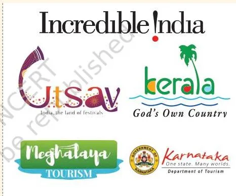
The ‘Incredible India’ logo has an exclamation mark in place of the letter I. The chapter’s point is that this small swap makes the word more expressive, and it invites you to look for the same letter play in other logos around you.
Figure: Grouping Cut Letters on an A3 Sheet
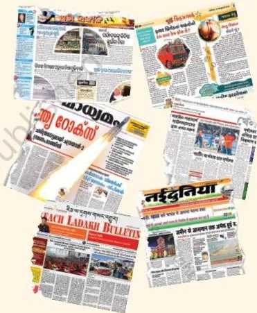
This is the finished step of Activity 19.2. The figure demonstrates the sorting principle: bold, thin, italic, decorative and narrow letters each go into their own group on the sheet. Sorting them by hand trains your eye to see letter anatomy in real print — the observation skill the next activity builds on.
Figure: The Same Letter Written Many Ways

Activity 19.3 opens with this table and the question behind it: can you read the same letter written in so many ways? The table’s point is that a letter is not one fixed shape — it is a small family of shapes that all still read as the same letter.
That range is what makes scripts expressive, and the activity will ask you to produce it for yourself.
Figure: Letter Anatomy Compared with Human and Animal Bodies
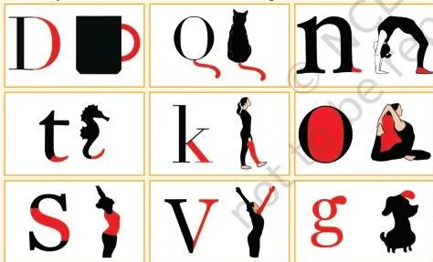
This figure carries the chapter’s analogy. Human and animal bodies share the same parts — bones, muscles, joints — yet each looks unique, and letters work the same way.
Letters share the same structural parts, but proportions, angles and thickness make each version different. That is why the chapter studies the anatomy of a letter before asking you to redesign one.
Figure: Poster Information After the Title
This figure shows the poster project’s second half. Once the title’s letter style is finalised, the rest of the poster — date, time and venue, contact information, and names — is written in clear, easily readable styles, with sizes that signal importance. The figure states the hierarchy rule visually: expressive title first, readable information after.
Definitions You Should Know from This Chapter
The activities assume you know a small set of terms. Each term below is defined in one plain sentence, the way the chapter uses it.
- Calligraphy — the art of shaping letters with care so they carry feeling as well as meaning.
- Script — an organised system of writing that records a language.
- Pictogram — a drawing that stands for an idea; letters began as drawings, then pictograms, then scripts.
- Letter — the smallest unit of any script.
- Shiro-Rekha — the top horizontal line of Devanagari letters, which gives the rupee symbol its Indian identity.
- Letter anatomy — the parts and structure of a letter that determine how it looks.
- Baseline — the line letters sit on; marking it keeps writing level.
- Top line — the line that marks the height letters must reach.
- Middle line — the line between the baseline and the top line, used for letters with middle parts.
- Guidelines — the baseline, middle line, top line and vertical grid marked before writing to keep letters even.
- Margins — the blank space left around the writing area on a page or poster.
- Letter style — the look of a letter, decided by its height, width, angles and line thickness.
Common Calligraphy Mistakes and How to Fix Them
Four mistakes show up again and again in this chapter. Naming them beforehand is faster than fixing them afterwards.
| Mistake | Correct rule | How to check your work |
|---|---|---|
| Treating calligraphy as neat handwriting | Calligraphy is expressive letter design — every letter should look deliberate and carry the word’s feeling | Ask of each page: does every letter look deliberate, and does the style match the word’s meaning? |
| Skipping the guidelines and grid | Always mark the baseline, top line, middle line and vertical grid before writing | All letters rest on the baseline, reach the top line, and the spaces between letters look even |
| Making the whole poster decorative | Only the title is expressive; date, time, venue, contact and names stay clear and readable | Read the information from arm’s length — if any detail is hard to read, it fails |
| Copying a logo or sample letter exactly | Experiment with lines and shapes — the chapter asks for your own variations | Your version changes height, width, angles or thickness rather than tracing the original |
How This Chapter Is Assessed: Learning Outcomes, Not Marks
This chapter is assessed through its own Learning Outcomes and summative assessment tasks, not through conventional question-answer exercises. What follows is the book’s own checklist of what ‘done well’ looks like.
Learning Outcomes. The chapter ends with a table used by both teacher and student. The checkpoints are: writing letters and words in different styles to convey feelings and emotions; connecting letter styles with personal ideas and emotions; experimenting with different mediums and tools; identifying and copying familiar lettering styles; and being cautious with margins, alignment and spacing.
| Learning outcome | What it means in practice |
|---|---|
| Writes letters and words in different styles to convey feelings and emotions (1.1) | The style of the letter matches the feeling the word carries |
| Connects letter styles with personal ideas and emotions (2.2) | The style you choose says something about the idea behind it |
| Experiments with different mediums and tools while doing calligraphy (3.1) | Tries quills, brushes, nibs, pens, inks and paints rather than one pen |
| Identifies and copies from familiar lettering styles while making artwork (3.2) | Recognises a style already seen and borrows from it |
| Cautious towards margins, alignment and spacing in calligraphy projects (3.2) | Writing stays within margins, aligned on the baseline and evenly spaced |
Summative assessment. The book suggests two example tasks. Individually: draw a self-portrait with any facial expression, choose an object or word that you think symbolises your personality and include it in the artwork, then apply rendering and lettering techniques and finish with colours.
The assessment looks at ratios and proportions, facial expressions, margins, alignment and spacing in the lettering, and colour and tonal variations.
For the group task: make a rag doll or fabric toy using unwanted pieces of cloth or any variety of fibre. It is assessed on trying out new ideas, planning the sequence of tasks with preparatory sketches, and choosing suitable materials and tools and using them carefully.
One honest note: textbook contents and the examinable syllabus are not always identical. Check the current official syllabus to confirm what is assessed before any exam.
Recap: What to Remember from The Art of Calligraphy
Five minutes before class or before starting an activity — these are the points that matter.
- Calligraphy is expressive letter-making, not just handwriting: artists pour feelings into each letter, and every letter style has a purpose.
- Letters are the smallest unit of any script; they began as drawings, evolved into pictograms, then into organised writing systems.
- Indian scripts are old: writing traces back about 5,000 years to the Indus-Sarasvati civilisation, and the earliest decoded Brahmi inscriptions are almost 2,300 years old.
- The handwritten Constitution was written by Prem Behari Narain Raizada in English and Vasant Krishan Vaidya in Hindi, signed on 26 January 1950.
- Letter anatomy method: mark a baseline, a top line and a middle line, add vertical lines for a grid, then alter the letter.
- Five variations of one letter come from changing height, width, angles and line thickness.
- Voice maps to size: loud words in big bold letters, soft words in small letters.
- Posters: expressive title first; date, time, venue, contact and names clear and readable after; guidelines and margins throughout.
- Tools: quills, brushes, nibs, inks and paints; surfaces: palm leaf, cloth and paper.
- Careers that use these skills: tattooing, graphic art, illustration and animation.
Related NCERT Class 7 Resources
This listing is maintained for the 2026-27 academic session using the NCERT textbook information available to us. NCERT remains the authority for confirming the latest edition.
This chapter is part of the NCERT Kriti (Arts) textbook for Class 7. The linked pages below give you the rest of the book and the wider Class 7 notes.
- Class 7 Arts (Kriti) notes — the subject page for the Kriti textbook.
- Textiles and Traditions — a related Class 7 arts page on fabric traditions.
- Integration of All Art Forms — a related Class 7 arts page on how art forms connect.
- Class 7 hub — notes for Class 7 across subjects.
- CBSE notes home — notes for all classes and subjects.
Sources and Data Verification
Where the information comes from. The chapter contents, activity steps, figure captions, learning outcomes and assessment criteria on this page describe the NCERT Kriti Class 7 textbook, Chapter 19, ‘The Art of Calligraphy’ — official edition on ncert.nic.in.
What this page covers. This page covers the Kriti (Arts) textbook for Class 7 only. It does not describe other NCERT arts books or other classes.
Session. This listing is maintained for the current NCERT edition available on the NCERT textbooks portal.
Who settles what. NCERT publishes and maintains the textbook, its chapters and its official PDFs. CBSE settles the curriculum and examinations. Textbook contents and the examinable syllabus are not always identical, so check the current official syllabus for anything that is assessed.
| What the chapter holds | Count | Where it is used |
|---|---|---|
| Printed pages | 10 | |
| Figures with NCERT captions | 5 | |
| Tables | 2 | |
| Official NCERT PDF | Download the chapter PDF | the chapter exactly as NCERT publishes it |
Reference: NCERT Class 7 Kriti textbook, chapter 19, official edition on ncert.nic.in.
Frequently Asked Questions About the Art of Calligraphy
What is calligraphy in simple words?
Calligraphy is the art of shaping letters with care and expression. Ordinary writing records words; calligraphy also gives each letter a form that carries the feeling of the word — excited, calm, loud or soft.
Why is the rupee symbol connected to the Devanagari script?
The rupee symbol is drawn from a Devanagari letter, and its top horizontal line is the Shiro-Rekha of Devanagari. That line, together with a second horizontal line, calls to mind the three bands of the Indian tricolour.
Who wrote the handwritten Constitution of India?
Prem Behari Narain Raizada wrote the English version and Vasant Krishan Vaidya wrote the Hindi version. The Constitution was signed on 26 January 1950, the day we observe as Republic Day.
How do I make different versions of the same letter?
Follow Activity 19.3: choose a letter and write it freely, then on a fresh sheet mark a baseline, top line and middle line, add vertical lines to form a grid, and create five variations by changing the height, width, angles and line thickness.
What information does a school poster need besides the title?
Date, time and venue; contact information; and names of people, organisations, institutions or performing troupes. These must be written in clear, easily readable letter styles, with sizes that show how important each item is, and followed by visuals.
Explore Class 7 Arts Books
Related chapters: